Evening all!
Wow, 2 posts in one day!! I guess you could say I’m on a roll, lol!
Well, seeing as the weather is all Wintery and dreary I decided what was needed was a big colour kick!! Something bright and vibrant to chase away the Winter blues!!
I also decided to put into action two ‘Crafter’s Resolutions’. I don’t tend to make New Year’s Resolutions as I never do anything about them, but Crafter’s Resolutions are something I should have better luck with!
My Crafter’s Resolutions are:
- to make sure I use my newest Papertrey sets/stash as soon as possible after getting them, thereby getting an earlier play-time and also putting them to use sooner even if they’re not quite in keeping with what I’m feeling like making. After all I might just surprise myself to be more creative that way! It also means that instead of being forlorn that my latest order still isn’t here yet that I can still get a buzz from inking up some of my newer sets!
- to give some of my older, more neglected sets a bit of love and bring them out to play too!
So, bearing in mind those resolutions, I put together a colour combination using Terracotta Tile (which I hadn’t had a chance to play with since it arrived), used some of my newest sets (Beautiful Blooms, Turning A New Leaf and Big & Bold Wishes), mixed it up with the colour combo (throwing a bit of Aqua Mist in), and using some of my older sets (Background Basics: Retro and Faux Ribbon).
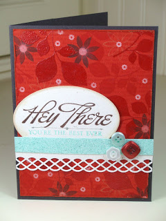
Here’s what I came up with for my first card:
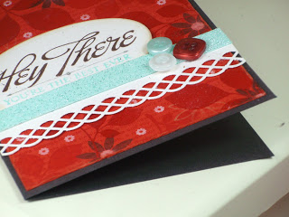
Now isn’t that cheerful?! A colour kick doesn’t have to be too loud and vibrant to still give a kick, and that Terracotta Tile really gives a kick!
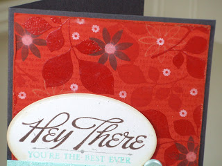
I started with a piece of Terracotta Tile cardstock and stamped the larger leaf from Turning A New Leaf using Versamark ink. I then sprinkled on my favourite embossing powder and embossed. This embossing powder is clear but it also gives a matt finish, so it’s more subtle and like a raised watermark instead, love it!!
I then stamped the smaller leaf in Versamark but left un-embossed. I stamped some of the blooms from Beautiful Blooms using Dark Chocolate and Vintage Cream inks, wiping off the Dark Chocolate where it met the embossed images as they create a resist. I used the same small flower for the centre of the larger ones but then rubbed with a tissue to blend and soften the image to give a soft centre. I then overstamped with Background Basics: Text Style II.
Once the pattern was prepared I cut to size and roughed up the edges with a nail file and scissors (I’m still waiting for my paper distresser to arrive!). I then inked the edges with VintageTouch Chai ink and adhered the panel to a Smokey Shadow card base.
I added a piece of Rustic Cream cardstock which was punched with my favourite Martha Stewart punch (the last thing I managed to punch with it before it broke [sob]) and adhered that to the card, overlapping the panel and going from edge to edge.
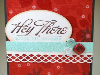
Then I tried something new – a strip of Aqua Mist cardstock, a strip of Scor-Tape – and a custom mixed Aqua Mist glitter! I took two different Martha Stewart glitters, tipped a bit of each onto a piece of paper and mixed together in the right proportions until I was happy I had an ‘Aqua Mist’ colour. I then applied that glitter to the strip and added that on to the card, overlapping the edge of the punched cardstock.
The main sentiment was stamped with Dark Chocolate and the smaller sentiment with Aqua Mist and then die-cut with my Petite Oval Nestabilities (used for the first time!). I added a thin line between the two using one of the stamps from Vintage Labels and only inking a very small portion of it so I just got the base line. I edged the shape with my VintageTouch Tea Dye Duo and the adhered in place so that the bottom part of the oval was behind the glittered strip. Finally I added a trio of buttons to finish it off.
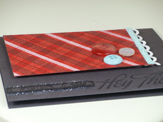
The next card used the same colours but has a totally different look:
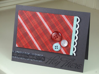
I think this is my favourite of the two! Maybe because it’s very Dawn McVey in style, but what can I say – that girl’s my inspiration!!
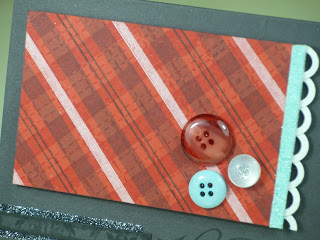
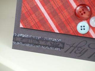
The time I used Faux Ribbon and Background Basics: Retro to create a ‘Plaid’ pattern on the Terracotta Tile panel. I stamped the strips with Smokey Shadow, Vintage Cream and Versamark, with the dotted lines stamped in Versamark and the double stripe in Dark Chocolate. It’s come out very ‘tablecloth-ey’ in my opinion, but I guess that’s what a plaid look is!!
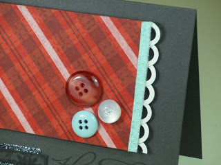
I trimmed the panel to size and added a punched border. As my Martha Stewart Punch has now gone to Punch Heaven and I don’t have a scalloped punch I had to come up with a different way to create the look I was after. So, taking inspiration from Nichole Heady’s second card here, I punched some cardstock circles from Rustic White cardstock using a hole punch, then punched out larger circles around them using a 1/2″ circle punch. I adhered the circles to the back of the panel using Scor-Tape. I created another Aqua Mist glitter strip and adhered that to the front, slightly overlapping the punched border.
I stamped the sentiment in True Black and then applied a strip of Scor-Tape to the left of it. I mixed up another batch of custom ‘Smokey Shadow’ glitter and applied that to the Scor-Tape strip. I’m really enjoying making my own glitter mixes but I now need to buy some little containers to keep the excess, lol!
I decided the glittered strip was a little too showy for my liking, so I added a small strip of leftover Smokey Shadow cardstock from a previous card/pattern. It had been stamped with Guidelines II and you can just about see bits of the pattern on the strip. I edged the strip with True Black ink and a Versamark Pen before adhering in place with Scor-Tape.
Finally, the last part of the card was to add a finishing touch of a trio of buttons. This should be a quick and simple process right? Wrong! I must have spent about an hour picking out candidate buttons, trying them out in different combinations and different positions, taking quick snaps of each one to compare and eliminate options, then staring and *staring* at the last two contenders before finally managing to pick one! Aarrgghh, sometimes I really annoy myself!! I think I made the right choice though – well, I better had!! The buttons and panel were adhered in place with Pinflair Glue Gel so there’s some nice depth between the panel and base.
So there you have it! What do you think of these two creations? Do they give you a nice kick to try out some new colour combos and brighten up Winter? I’d love to know what you think of them!

I love your Crafters Resoloutions and your cards! The top one especially – the mix of blooms and embossed leaves is totally yummy!
Oh wow, I am so in love with the first card! The colors, layout, stamp sets…everything is perfect!
These cards and color combos are gorgeous!!
Very pretty cards! I just bought that punch you used on your top card, today! I can't wait to use it now that I've seen your lovely card 🙂
Loving the boldness! This weather certainly makes us wanna play with bright colours LOL!
The second one is my fave for layout but the background panel you created for the first one is fab! Love the depth of the leaves with the embossed and un-embossed effect!
Aimes
x
Beautiful work! The way you layer all of the stamps to create your backgrounds is amazing!
Love, love, love the colors! Love the glittering, too. How creative to come up with your own Aqua Mist color. I never even thought to try and make my own. Very nice job!
Wow, vibrant is RIGHT…these colors pop out of my screen. 🙂 I'm with you… I think I prefer the second one, but I'm a sucker for a good plaid (and even MORE of a sucker for an argyle pattern). You did such a great job on both of these! 🙂